![]()
![]()
![]()
![]()
![]()

How to build the roman vexillum

In the Roman military culture, there is a varied number of standards (signa) that had prestige, recognition, referentiality and often also magical-religious meanings. In recent years it has been written about possible tactical uses, but, in the absence of evidences, the considerations offered do not seem convincing enough to make it probable their function in this sense. However it is recorded that recently the cinema has taken such hypotheses contributing to spread that idea 1 that is sadly also found on Wikipedia along with a series of news unfortunately once again all to be verified.
As is widely known, the standard that grouped all the above mentioned meanings was undoubtedly the eagle. Always present in the battle as to give a look of protection from above, his loss or capture by the enemy was considered one of the greatest misfortunes and gave rise to the dissolution of a legion or even to punishment and death sentences of soldiers and officers.
Vexillum was just one of the many possible standards in use among the Roman military, and by far the preferred of the historical re-enactors for its ease of construction. Unfortunately little is known about its functions and the role it could take even in relation to other "heavy" or metal signs. One of the few possible hypotheses refers to the numerous reports on the so-called vexillationes, suggesting that this drape, ancestor of the flag, as a type of minor standard that could be attributed to detachments of legions or cohors maybe set for particular missions and group for example centuries or cohors2 3.
It was also assumed that the vexillum could be designated to represent the cohorts in the imperial age, but the hypothesis is currently just speculation.
Evidences
Little more can be deducted on dimensions and appearance from the number of sculptures and reliefs, but research is much difficult about color, fabric and style because of only two findings.
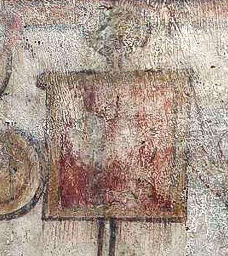
The first, certainly the most famous and complete, is the almost intact vexillum found in Egypt and now housed in the Pushkin Museum in Moscow, it represents a Victory Goddess (Nike) on a red background. 47 cm in height and 50 in width, the fabric is linen and the design is painted over the fabric. Note the interesting image of the spheroidal world under the feet of the human figure. Inside the rim in the upper part there is still today the supporting bar. The records also report an important detail: in the lower part there is a trace of the fringes, mostly lost, as continuous of the warp and not, as in use in modern times, deriving from the application of trimmings.

Pic.1 - The vexillum found in Egypt with the depiction of Nike goddess. At the bottom there are some traces of the fringes, clearly evident in the warp, probably also colored in yellow.
The only other discovery of a well-known vexillum is the one found on the Palatine Hill in Rome and hypothesized as the "Imperial banner of Emperor Maxentius". The find has come to us rolled up and in very bad condition, but two elements found are significant: the first is that the fabric was perhaps silk mixed with linen 4 and some traces of red pigmentation have been identified 5.
Other colored representations are equally rare and often indecipherable, only in one case a vexillum is clearly distinguishable and it is a famous fresco on one of the walls of the Dura Europos synagogue in Syria. The fresco is interesting for several reasons, but keeping the eyes on the vexillum we can see that once again the red is the color that serves as background. The border is enriched by a thick yellow-gold frame that differs from the one found in Egypt that has only the four corners with the characteristics yellow "L" in the four corners. Very important is the presence of equally red fringes on the lower edge just below the frame. One can easily conclude that the fringes derive directly from the warp of the red-dyed fabric. Furthermore, it is also possible to pin it to the rod with a single lace on two distinct points of the horizontal tensioning stick, as also evident from many examples of the statuary.
Back to the the colors there is another example dating back to the fifth century AD: a codex kept in the Cathedral of Rossano Calabro showing an episode of the Gospel that most likely involves a Roman authority. The most noteworthy thing is that the background is in the classic "Egyptian blue". The large golden border is completely identical to that of Dura Europos, while the central design in which human figures seem to stand out is different from other examples.
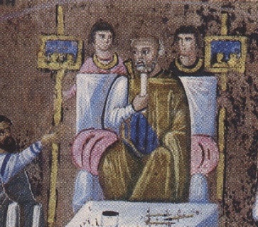
Pic.2-3 - Left: vexillum depicted on the fresco today kept at the Yale University Museum (USA). The fringes of the same color of the fabric are clearly visible. On the right: the two blue vexillum of the Codex of Rossano Calabro.
Discussions
The old vexillum in use since 2004 had many problems that we have unfortunately delayed to fix because of the usual inertia within a group of reenacters that is always managing more and more urgencies with priority over a new vexillum.
The problems started from the design that had a too modern shape with the usual incorrect "aggressiveness" of the drawings of our era. Even the fringe of modern trimmings was a critical factor not found in archeology even though it is an element present in almost all the banners reconstructed by other re-enactors, so giving little attention we have not been spurred to change.
Fig.4 - The old vexillum used from 2004 to 2018 in the Cohors III Praetoria (Cisalpina Cultural Association) with the two studded leather ties. Today hosted in a private collection.
With so few findings, among other things also very distant in the timeline, it has not been possible to define complete guidelines for a perfect reconstruction for which we have granted ourselves a very limited license with respect to the findings.
Fabrics
The chosen textile material is linen as from the example of the Egyptian example.
The background
The color chosen for the background is the usual "Egyptian blue" (today called just blue or "royal blue") for reasons of adherence to the color choices made for the Cohors III Praetoria 6, largely justified by the fresco in Rossano Calabro even if it doesn't depict a military scene. The same choice, however, was made over the years by many Praetorian reenactors in the world, even if with justifications maybe different from ours or could be by simple imitation.
The fringe
One of the big changes was the removal of the gold trimmings, probably not philological, with fringes made by hand starting from the excess warp of the linen fabric. The choice was made easier by observing the Dura Europos example.
The hook
While waiting to install a suitable and more philological lance point to support the fabric, we opted for a simple hook solution where a fabric lace is inserted from two different points on the tensioning stick. The solution is also in this case borrowed from the fresco by Dura which clearly shows a connection on two points.

Fig.5 - Detail of the hook on the stick.
The choice of the subject and the writing
We confirmed the debate made in 2004. The only material example found shows a drawing of a subject, and this feature is confirmed by many other depictions, mostly sculptural. To the image we have therefore associated a written although the use of written is much less attested probably because these were painted on the sculptures and then lost over time.
The acronym "COH III PR" is widely attested by the sources as identifying the Cohors Tertia Praetoria (Figure 10) and the font type imitates sculptural examples.
The choice of the subject of the image
The decision on the design of the scorpion was preceded by a discussion that took many years. To report part of the debate, however, it is necessary to give some elements concerning the aesthetic and artistic canons in vogue in ancient times and not referable exclusively to Roman culture.
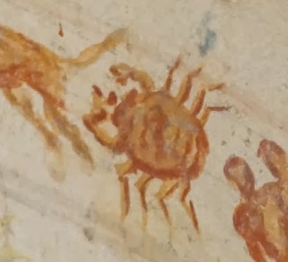
Archeology has brought us countless examples of depictions of "fearsome" animals, which their artistic representation had mainly symbolic motivations that arouse emotions. Emotions, such as fear, were not a aroused by the image itself, but by the symbolic meaning.
From this it derives then that the shape could not be perfectly adherent to reality and in some cases deliberately deviate from it. To give a very clear example, the representation of the lions in Mediterranean cultures appear to our eyes almost like plush toys for children, having none of the elements of aggression, hyper-realism or stylization typical of today's arts. It would be a very interesting topic from a sociological point of view, but we would definitely be off topic in this article.
To underline the intentionally unreal and symbolic imprint ancient artist deliberately used fantasy colors that, although today are lost, in many cases it was possible to find out what it was originally and in more than one case lions were found in whole or in part colored with blue as in one of the Greek examples shown here.
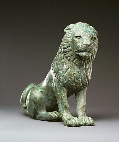
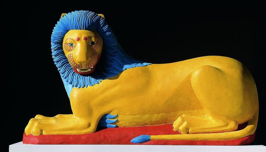
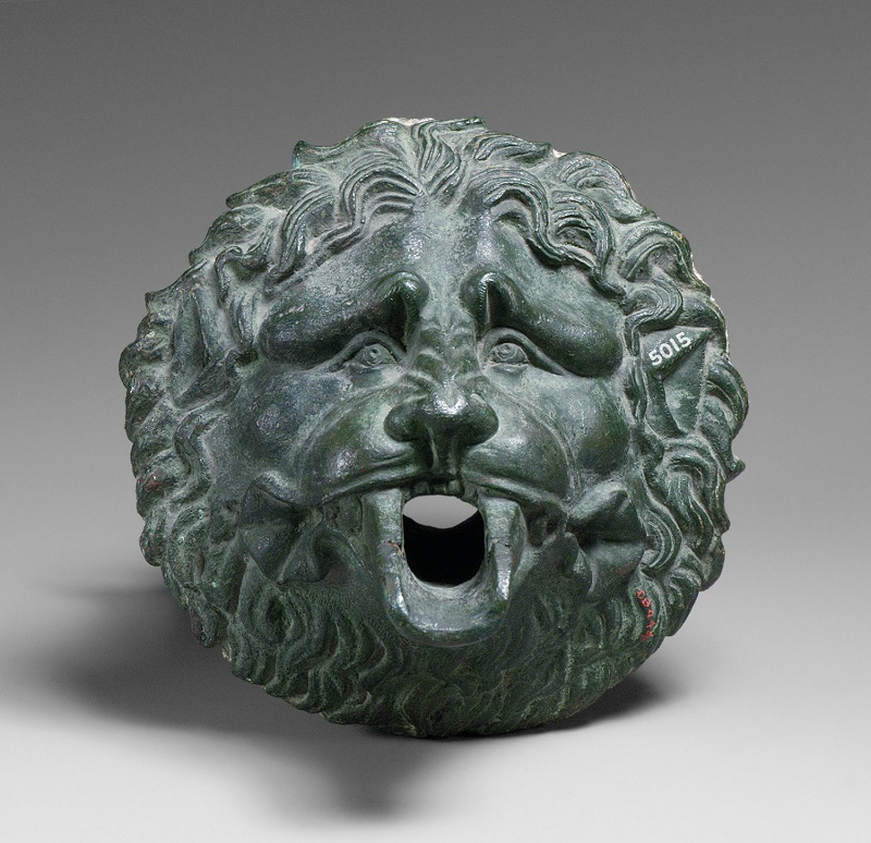
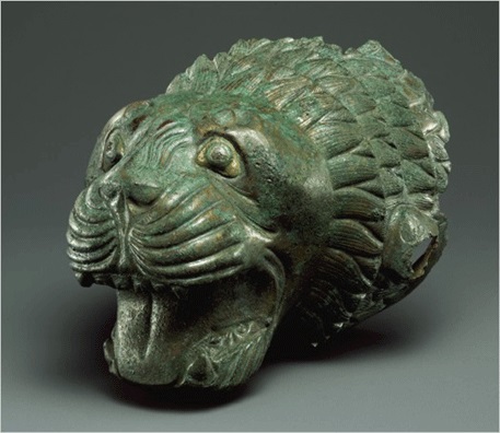
Figg.6-9 - From the Left: examples of unrealistic lions from the Greek and Roman periods. In the second image the original colors have been recovered with surprising imaginary colors to underline the precise intention of non realism.
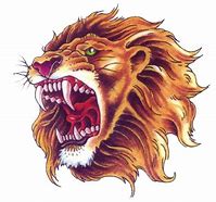
Figg.10-13 - Examples of modern graphic representations in strong stylistic contrast with ancient examples. Although we divide between extreme stylization or extreme realism, the common denominator seems to concern the fact that it should be the same image to suggest fear, aggression, strength, dignity, authority, and not derive these values or feelings from a symbolic meaning associated with it .
Once the stylistic guideline has been agreed, it was necessary to do a very long research to recover examples of the Roman era and then to reconcile the desire not to get too detached from the "commercial" logo of the Project, which is the reproduction of an authentic Roman scorpion recovered from an original engraving.
Once confirmed that we can only use a scorpion, the zodiac sign of Tiberius that formally established the Pretorian Guard, as subject, widely attested on any Praetorian standard (unfortunately except vexillum), and once the stylistic guideline was clarified, it was necessary to find the average between: a philological design, preferably from a finding, the "commercial" logo of the Project, that is the reproduction of an authentic Roman scorpion recovered from an original engraving, and an image that, in our modern eyes could appear better than a "Disney" representation. On this page we have reported a good number of various scorpions we took into consideration.
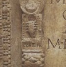
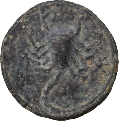
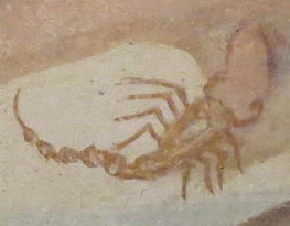
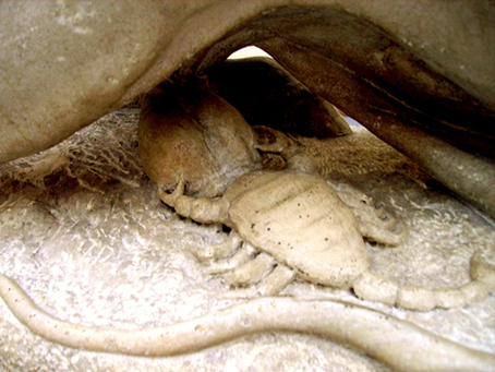
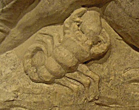
Figg.14-19 - From the Left: the scorpion certainly attributed to the COHORS III PRAETORIA from the tombstone of Marco Pompeio Aspro; example of a coin; fresco; fresco; allegorical sculpture; sculpture with zodiac sign.
The enormous work of reconciliation of so many desires was made out by the master decorator Alex Sedici who succeeded in giving greater shape and three-dimensionality to a form that appeared at the origin slightly stylized. One of the elements that has been kept from the original, for example, is the bad representation of the sting, which on the vexillum of 2004 was too perfect.

Fig.20 - Various visuals of the ring with the scoprion image. In blue paste the imprint of the seal obtained from the ring.
The hem
Last license taken by us is an interesting additional decoration visible on the golden edge. The theme was taken from the edge of one of the Louvre Praetorians where there are flowers interspersed with small plates with some large "X" from corner to corner making sense the number ten in Roman numerals. From this assumption we have replaced the number with the "three" which in Roman numerals is represented by three bars "III".
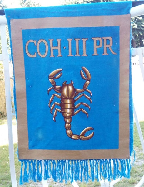
Fig.21-22 - From left: the decoration of the shield of the Praetorian of the Louvre, alongside the decoration obtained with the replacement of the "number" 10 with the Roman number three ("III").
Making of the vexillum
The realization was entirely entrusted to Fabrica XVI by Alex Sedici, who took care of all the aspects listed in the previous paragraphs.
The base is composed of a sandwich of two layers of linen interspersed with a light layer of felt to give greater consistency and stability.
The decoration was made entirely by hand as well as the fringes in the lower part.
The realization was completed with about three weeks of full-time work.
The value of the item shown on this page is approximately 700 euro in 2018.


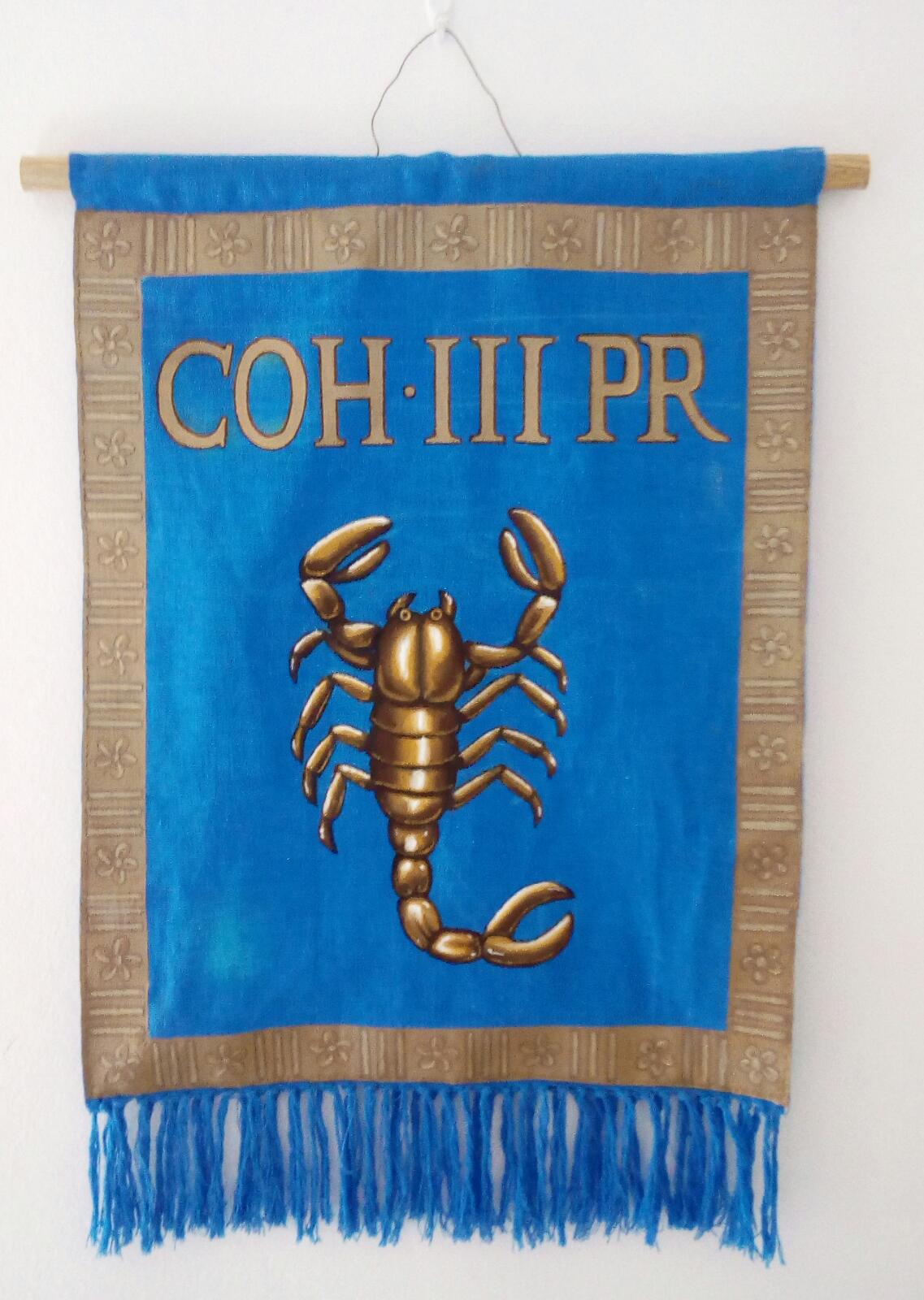
Fig.21-22 - From the left: some stages of processing on the edge. In the second image the first attempt to replicate the "X" subsequently replaced by the "III" logo. On the right the final result before applying external accessories.
Notes
1 In example the movie "Ben Hur" (2016).
2 I.De Bohec - The Roman Army (2000)
3 F.Gilbert - Prétorien #43 July 2017
4 C.Pannella (2011) - "I Segni del Potere" The presence of both linen and silk could be due to reciprocal contamination process during the time, of two different pieces: the rare silk for the vexillum and the most common linen probabily used to hold the rolled vexillum.
5 C.Pannella (2011) - "I Segni del Potere" The presence of steel or iron points could be responsible for the red colour evidence due to mineralization during the centuries and not to be related to the original colorization.
6 Ref. Project #1 of the Associazione Culturale Cisalpina.
As mentioned in the project guidelines, in this reconstruction avoid the use of black and dark blue that are not referred as "roman" colours, with the known exceptions, but clearly an error in reenactment of the early empire.
(C) 1996-2026 Luca Bonacina